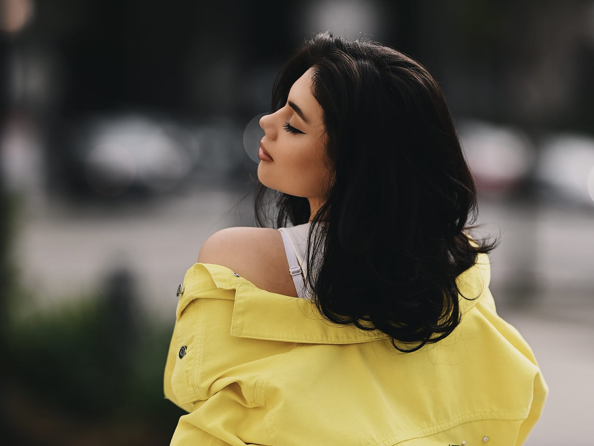
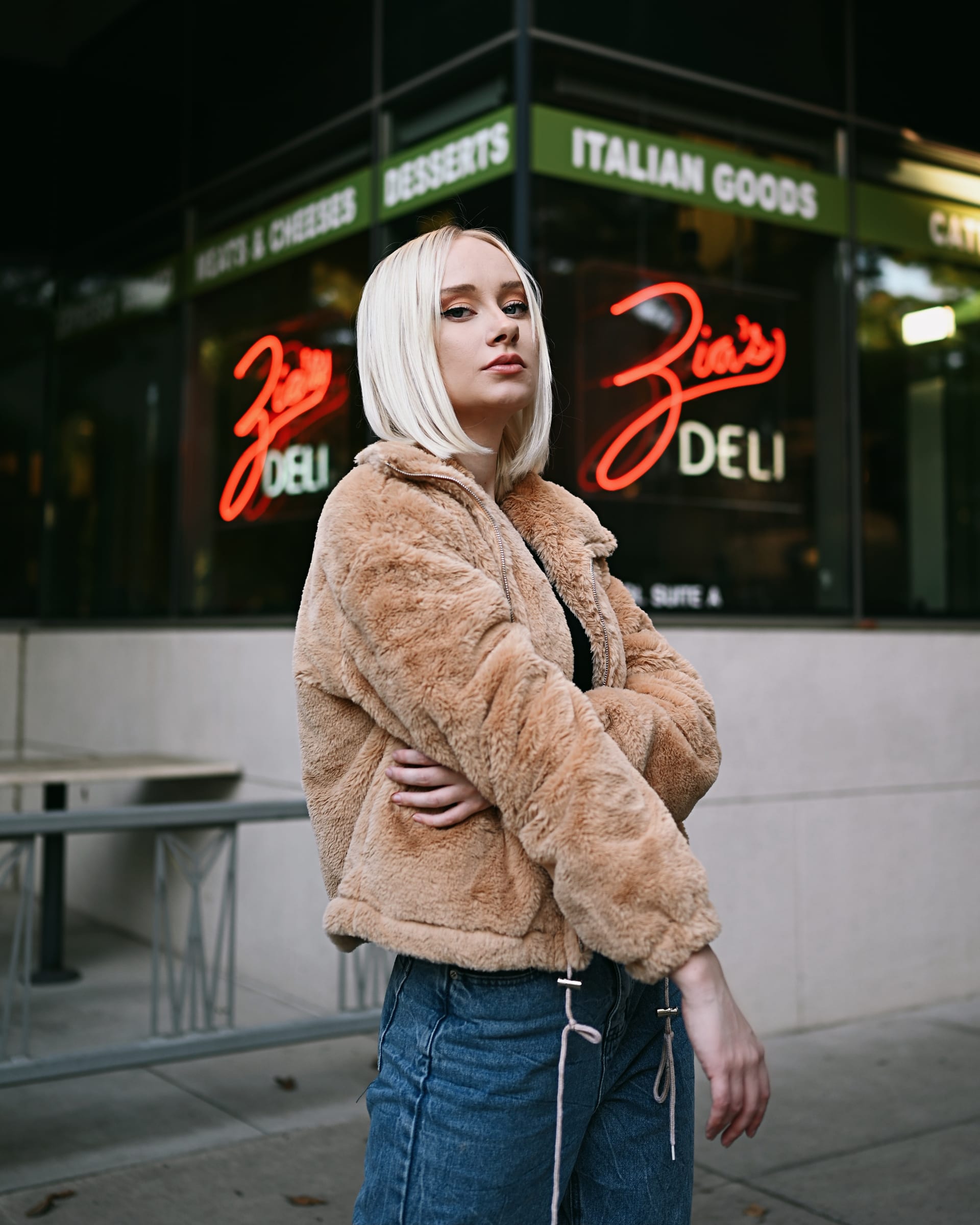
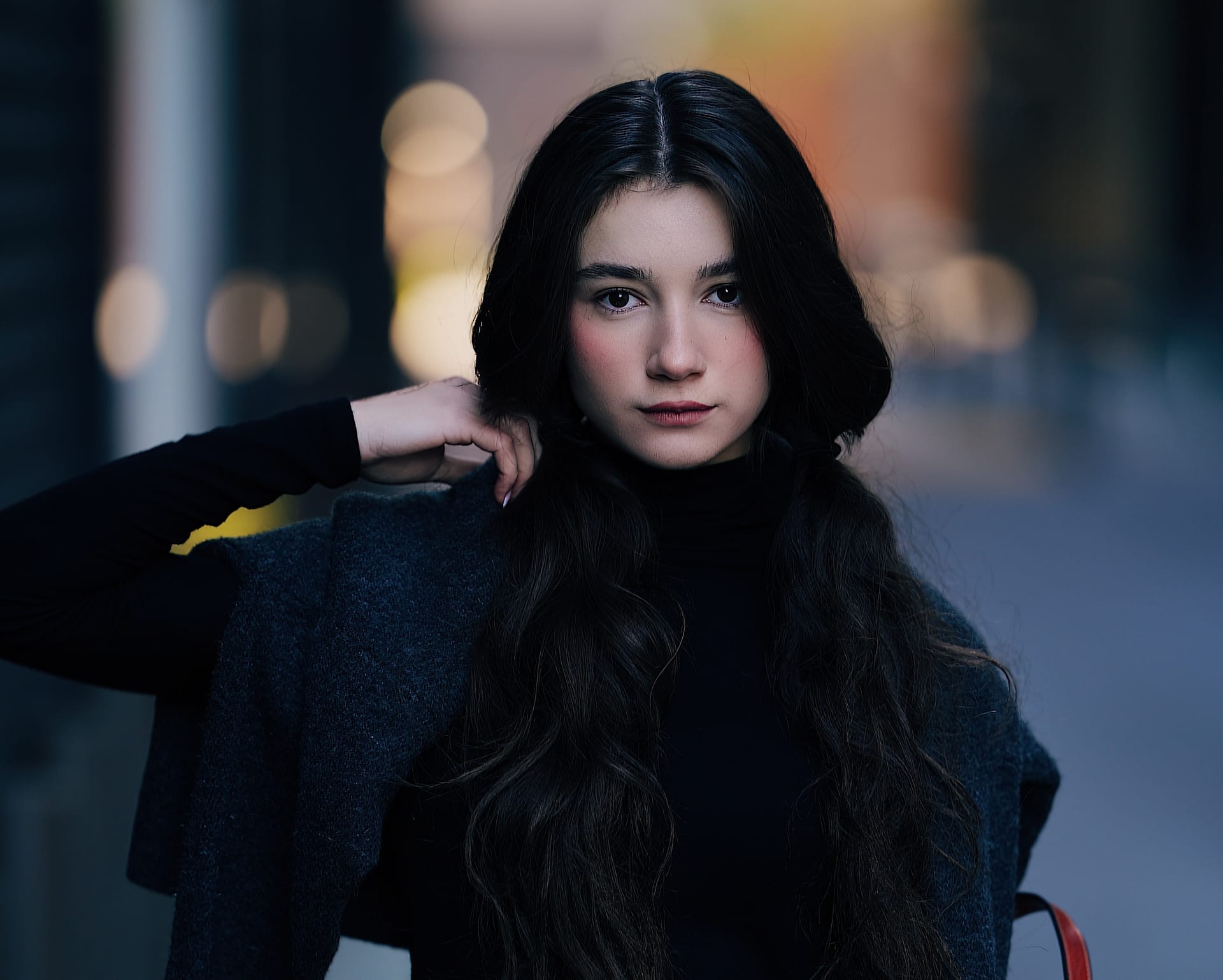
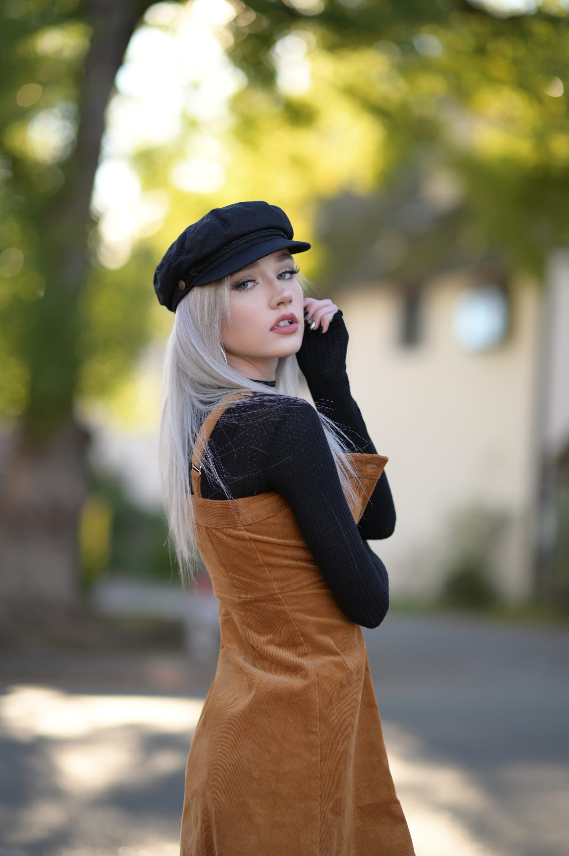
Fujifilm
Fujifilm X-H2 + XF 56mm f/1.2 R WR — Summer Garden Portraits with Rosina
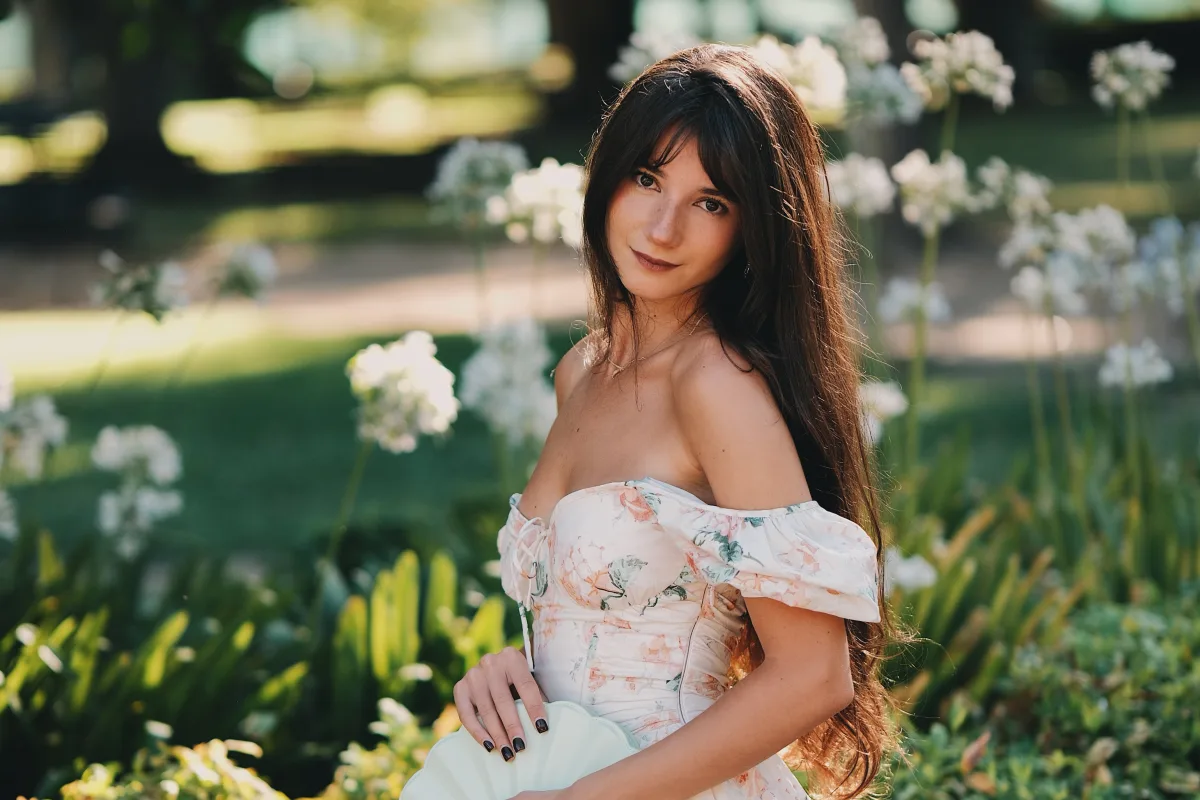
A full summer session in the gardens with @rosinashakirova — 89 frames across a park lawn, three separate rose beds, agapanthus, banana palms, and deep shade, all shot on the Fujifilm X-H2 with the XF 56mm f/1.2 R WR.
This is the lens I keep coming back to for portraits on X-mount, and this session is a good demonstration of why. It's not just the aperture. It's what the lens does with light at the edges of its comfort zone — shooting straight into low sun, holding onto deep saturated reds without smearing them, and rendering skin with a kind of three-dimensionality that's hard to describe until you see it next to something else.
Gear & Settings
- Camera: Fujifilm X-H2
- Lens: XF 56mm f/1.2 R WR (85mm full-frame equivalent)
- Aperture: f/1.2 for nearly everything, stopping to f/1.6–f/2 for full-length frames
- Mode: Manual, ISO 125, shutter varying with the light
- Film Simulation: Classic Chrome (recipe below)
- Editing: VSCO on iPhone, minimal — mostly just exposure nudges
My Classic Chrome Recipe
This is what every frame in this post was shot with, straight out of camera:
- Film Simulation: Classic Chrome
- Color: +3
- Highlight: -1
- Shadow: 0
- Sharpness: +1
- Noise Reduction: -2
- Color Chrome Effect: Weak
- Color Chrome Blue: Weak
- White Balance: 6000K
If you want the full breakdown of why each of these values is set the way it is — including a second Provia recipe and my autofocus menu setup — I wrote that up separately in my Fujifilm X-H2 camera settings guide.
One note on the white balance: 6000K is a starting point, not a rule. In open shade under the tree canopy I dropped closer to 5800K, and shooting into direct sun near the end of the session I let it sit warmer. Adjust in 100–200K steps against your subject's actual skin tone.
Golden Hour on the Lawn — Backlight Control
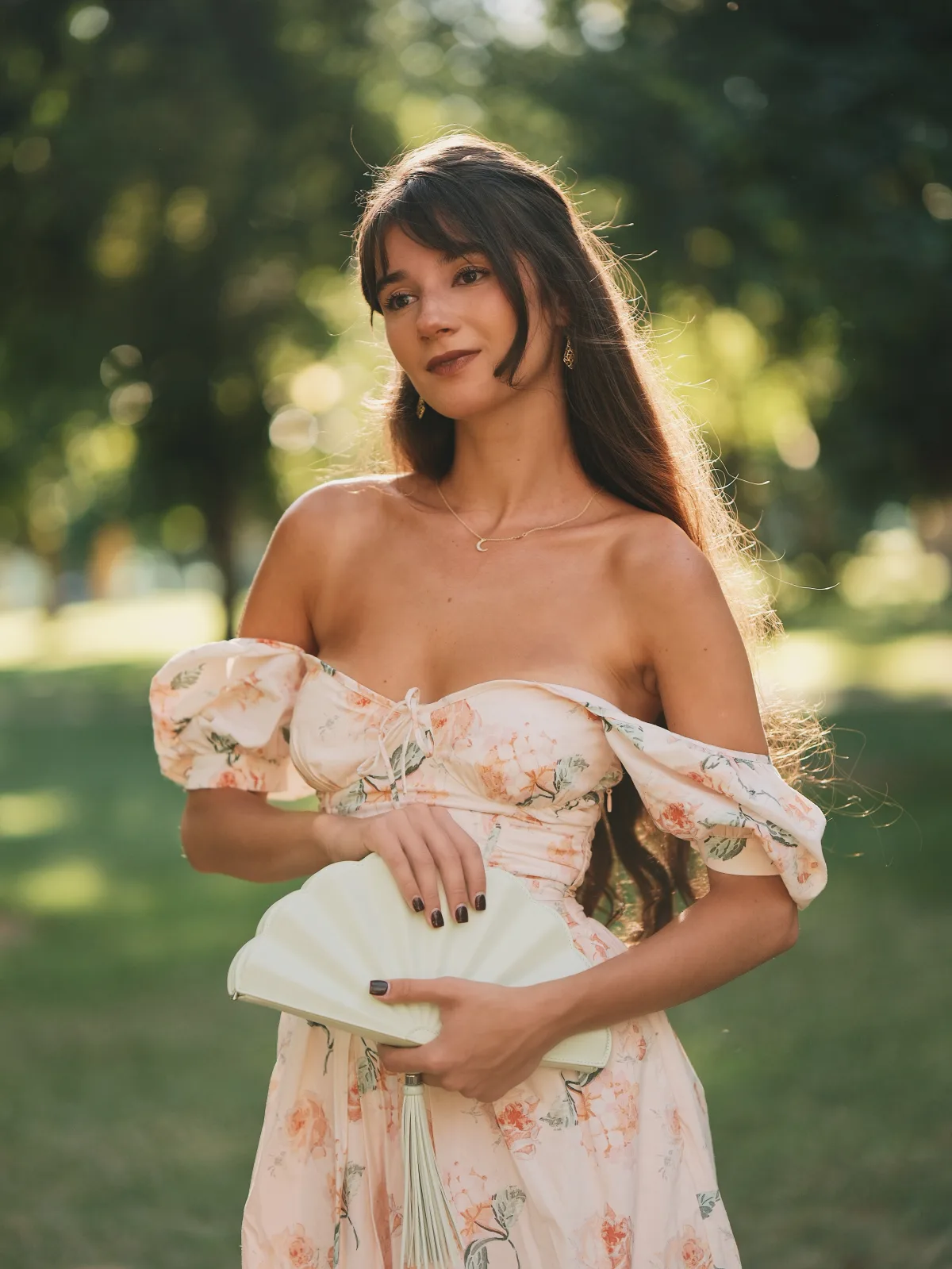
The session opened on an open lawn with the sun low and directly behind her. This is the hardest thing you can ask of a fast prime, and it's where the 56mm f/1.2 R WR quietly separates itself from cheaper alternatives.
Shooting straight into low sun at f/1.2, most fast primes do one of two things: they veil the whole frame in a milky haze that kills contrast, or they throw hard green and magenta flare artifacts across the subject. The 56mm does neither. What you get instead is a controlled, low-level glow that lifts the shadows slightly and leaves the midtones intact — the image stays readable. Her face holds contrast even with the sun blowing out directly behind her head.
Look at the rim light through her hair. Every individual strand catching the sun is resolved separately rather than blooming into a single bright mass. That's the lens's flare control and its micro contrast working together — it's holding onto fine tonal separation right at the point where the highlight is about to clip.
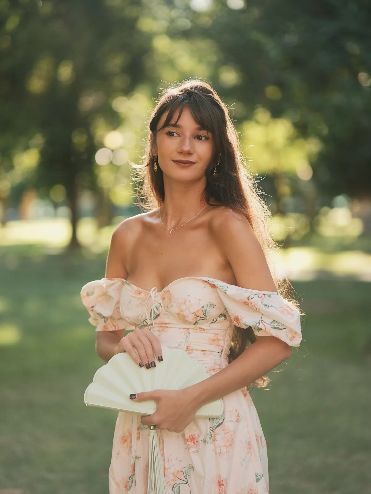
A practical note on metering backlight: with Interlock Spot AE tied to the focus point (see my settings guide), the camera meters off her face rather than the blown-out background. That's what keeps her properly exposed here instead of turning into a silhouette. Highlight -1 in the recipe then protects whatever the background is doing from clipping into pure white paper.
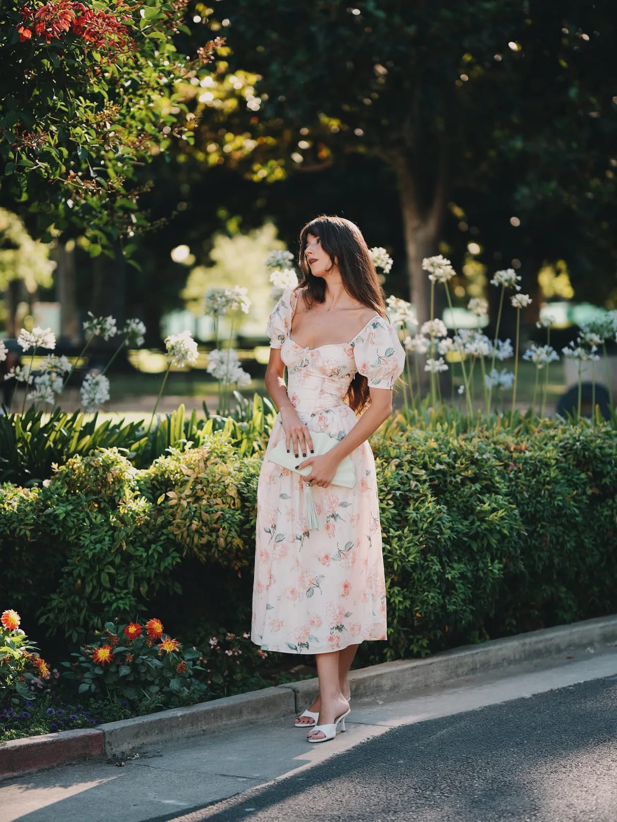
The bokeh in this set is worth pausing on too. The tree line behind her is 30+ feet back, rendered as soft overlapping discs with no hard outlining and no onion-ring texture. At 85mm equivalent and f/1.2, you get medium-format-like subject separation on an APS-C body.
Deep Reds — Classic Chrome in the Rose Garden
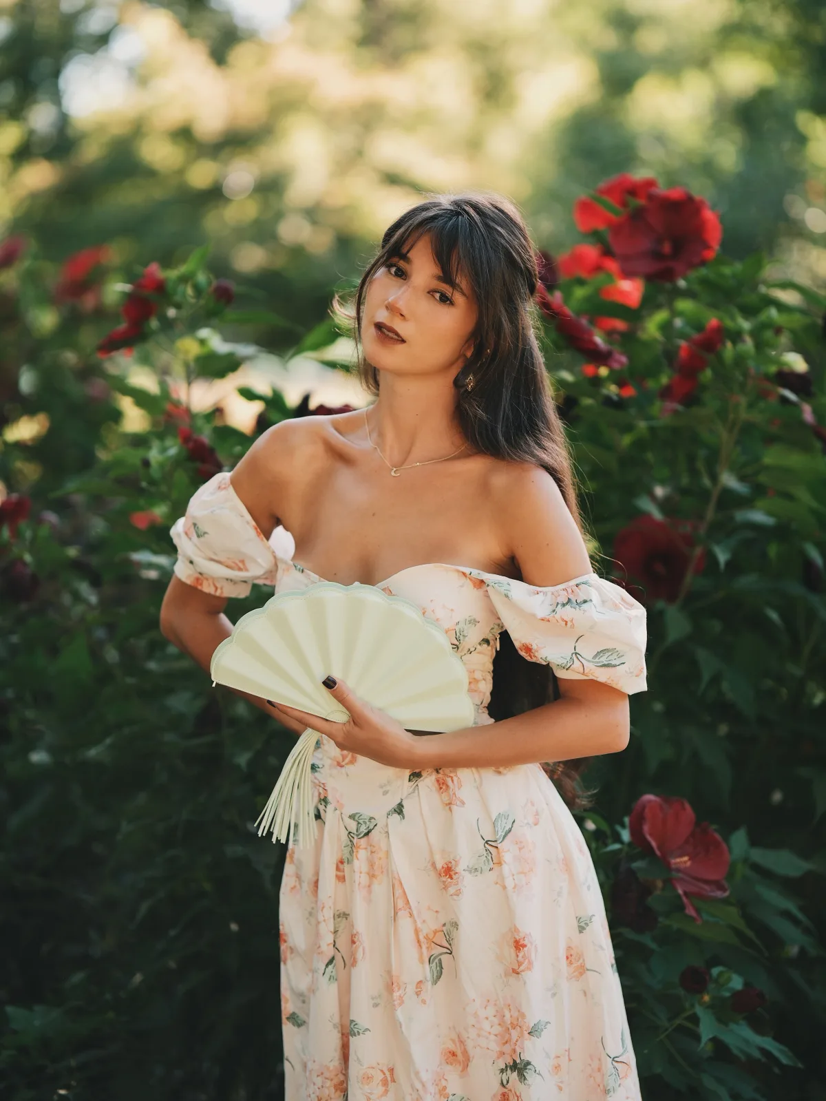
This is my favorite set of the day, and it's the clearest argument for Classic Chrome I can make.
Deep saturated red is the single hardest color for a digital sensor to handle. Push saturation and the red channel clips — the flower turns into a flat red blob with no petal detail, and the transition into shadow goes muddy or posterized. It's the same reason red stage lighting wrecks so many concert photos.
Classic Chrome handles this better than any other Fujifilm simulation because its baseline saturation is low. Starting from a muted palette means there's headroom — I can push Color to +3 to get the reds looking rich and still be nowhere near the clipping point where petal structure disappears. Combined with Color Chrome Effect on Weak, which specifically tone-maps saturated colors to preserve detail, the dahlias and roses here hold their internal shadow gradients completely.
The result is a red that reads as deep rather than loud. It doesn't fight her skin tone for attention, and it doesn't scream "oversaturated digital." That's the film look people are chasing with Classic Chrome, and it's most visible exactly in scenes like this one.
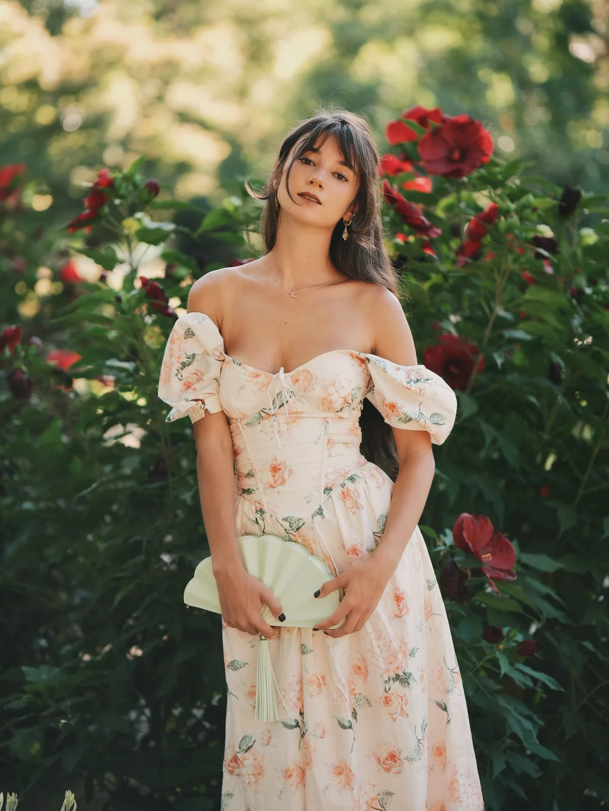
The other thing happening in this set is dappled light. Sun coming through the canopy above created bright patches directly next to deep shadow — a brutal dynamic range test. The X-H2's 40MP sensor has enough latitude to keep both ends, and Highlight -1 keeps the bright patches from going to paper white.
Pathways & Crepe Myrtle
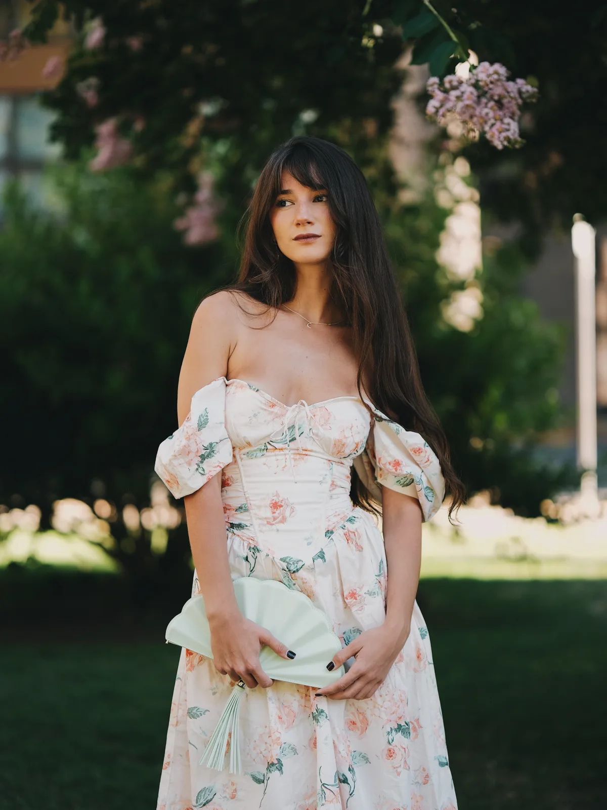
A shorter transitional set as we moved between beds — pale lilac crepe myrtle overhead, full-length walking frames, and a few wider environmental shots.
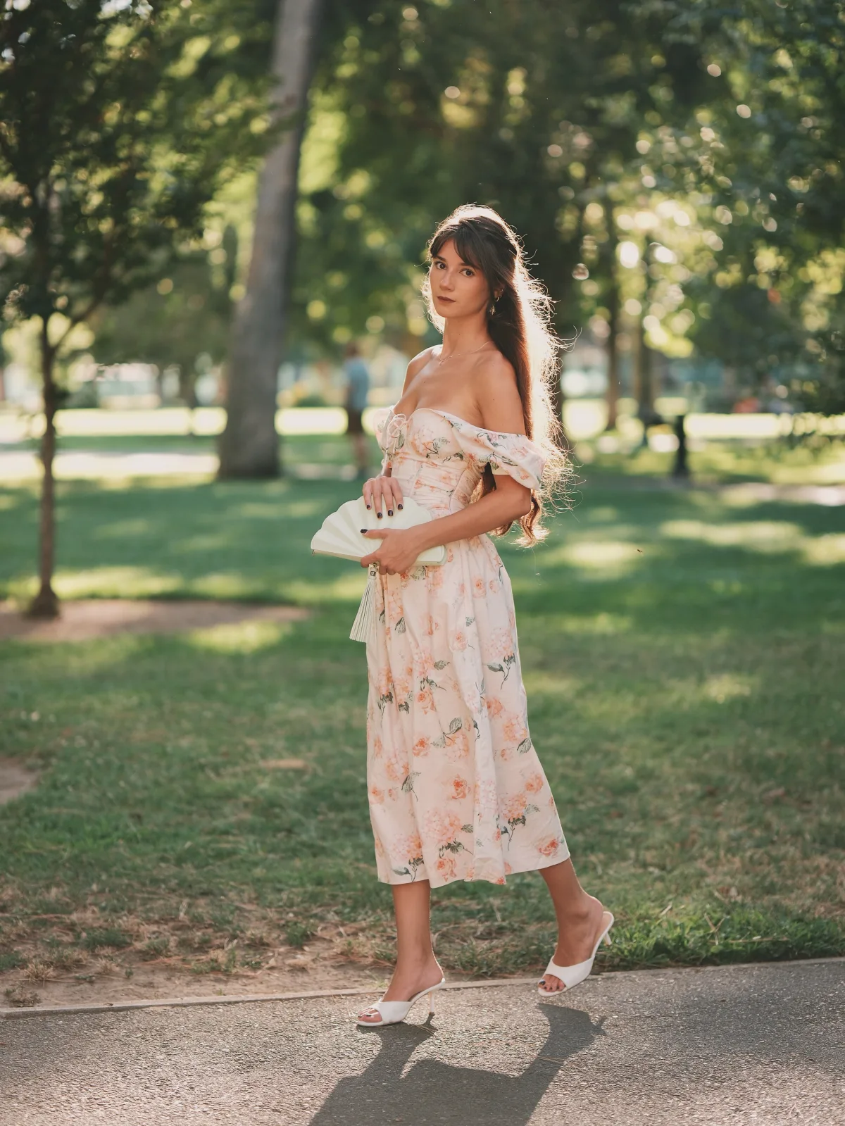
Full-length at 85mm equivalent means backing up a fair distance, which is exactly where a lot of fast primes get soft in the corners or show field curvature. The 56mm stays consistent. Her shoes are as sharp as her face in the frames where the focal plane covers her whole body, and the path lines running toward the background stay clean rather than smearing at the frame edges.
I stopped down slightly here — f/1.6 to f/2 — not because f/1.2 wasn't sharp, but because at full length you want a hair more depth to cover head-to-toe.
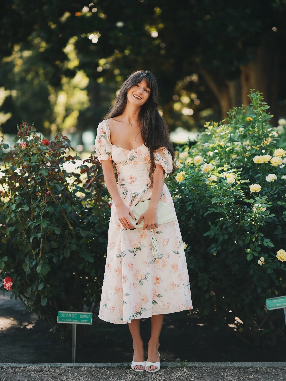
The Rose Garden — Yellows & Soft Pinks
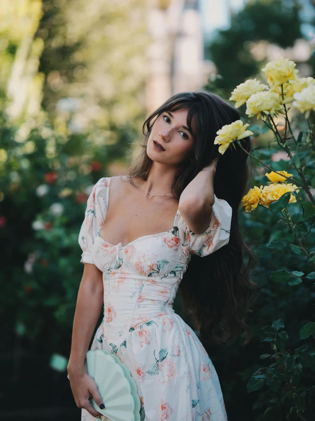
A completely different color problem from the red bed: pale yellows and soft pinks, which are easy to wash out into an undifferentiated cream blur.
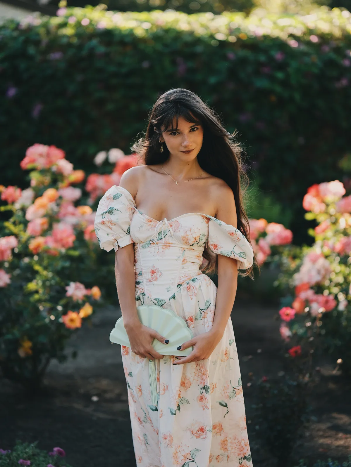
This is where micro contrast does the heavy lifting, and it's worth being specific about what that term means. Regular contrast is the difference between the darkest and brightest parts of an image. Micro contrast is the tonal separation between adjacent, similar tones — the difference between a pale yellow petal and the slightly paler yellow petal behind it.
Lenses with weak micro contrast render those two petals as one shape. The 56mm f/1.2 keeps them distinct. You can see the individual layers in the yellow roses, and more importantly, you can see it in her skin — the subtle transition from lit cheek to shadowed jaw stays smooth and dimensional instead of flattening into a single tone. That's the quality that makes portraits from this lens look sculpted rather than pasted onto a background.
It also explains why Sharpness +1 and NR -2 work so well with this lens specifically. Cranking sharpness on a low-micro-contrast lens just creates halos. On a lens that already resolves fine tonal steps, a light sharpening touch enhances what's genuinely there, and pulling noise reduction down to -2 stops the camera from smoothing away the skin texture the lens worked to capture.
White Agapanthus — The Cover Frame
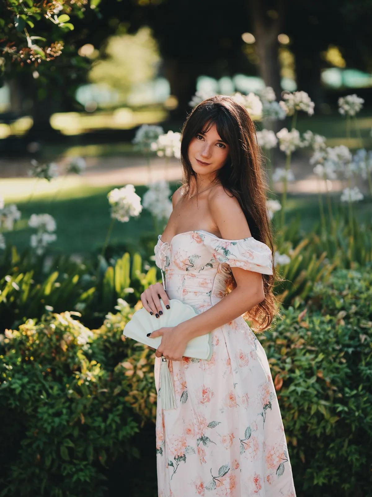
The cover photo for this post came from this set, and it's the frame that best summarizes the whole session.
Agapanthus are essentially small white explosions on tall thin stems — a nightmare subject for bokeh because each floret is a tiny specular highlight against dark foliage. A lens with busy bokeh turns that background into visual noise that competes with your subject. Here they render as soft, evenly-weighted clusters that read as texture rather than distraction, and the out-of-focus stems don't double-edge the way they do on lenses with nervous rendering.
She's also lit from behind and slightly to the side, which puts a rim on her hair and shoulder while the front of her face falls into soft open shade. That's about a two-stop range across her face alone, and the tonal gradation across it stays completely smooth.
Coral Roses — Peak Color
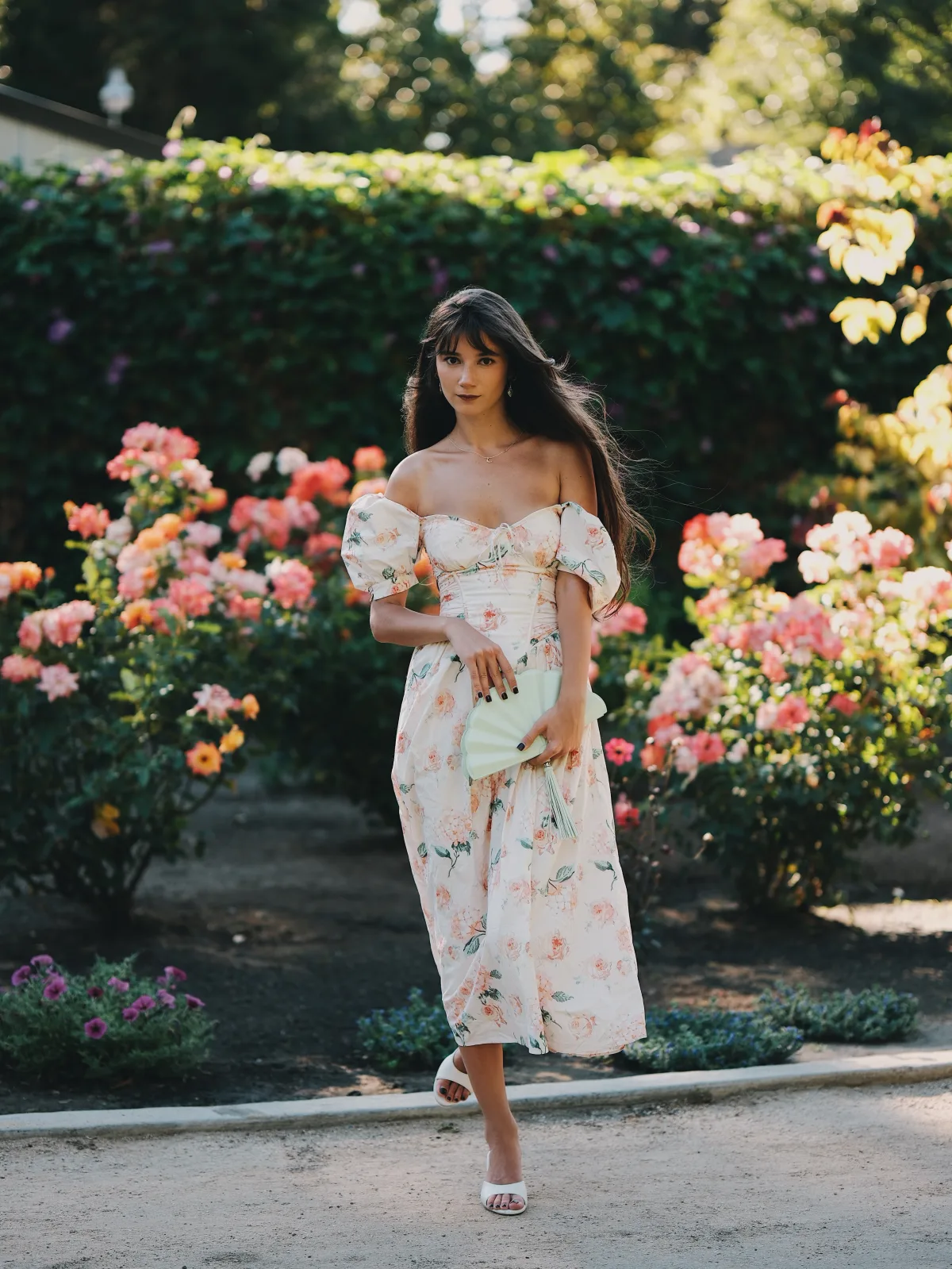
The coral and peach rose hedge was the strongest color moment of the day, and it happens to be the exact hue family that Color Chrome Effect was designed for.
Coral sits right between red and orange — the two channels that clip first and the two that skin tones live closest to. Get it wrong and either the flowers go neon and flat, or you pull saturation back so far that the roses and her skin both look lifeless. Color Chrome Effect on Weak threads that needle: the roses keep their internal petal shading and their gradient from deep coral at the center to pale peach at the edges, while her skin stays natural.
Her dress is a pale floral with peach tones, so this set is essentially a monochromatic color study — subject and background in the same family, separated purely by depth of field and micro contrast rather than by color difference. That's a hard setup to make work, and it's a good demonstration of why lens rendering matters as much as color science.
Garden Paths & Banana Palms
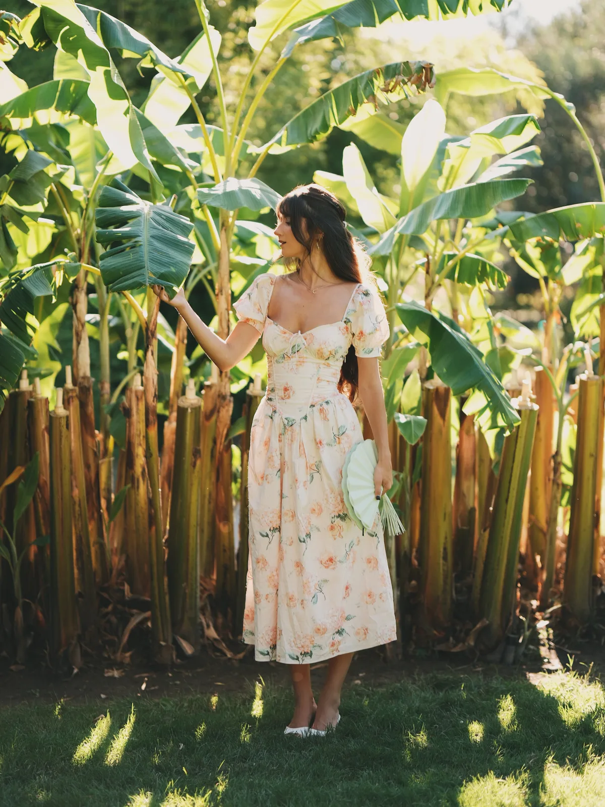
Late afternoon, harder light, and a change of scenery — sunlit garden paths and then a stand of banana palms with big backlit leaves.
The palm frames are a nice test of a different kind: those broad translucent leaves glow when the sun comes through them, and the greens go extremely saturated. Classic Chrome pulls them back from the electric green you'd get out of Velvia or even Provia, keeping them believable while still letting the backlit sections luminesce.
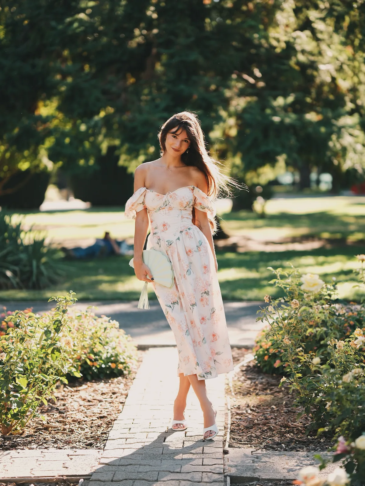
Into the Shade — Hibiscus & Canopy
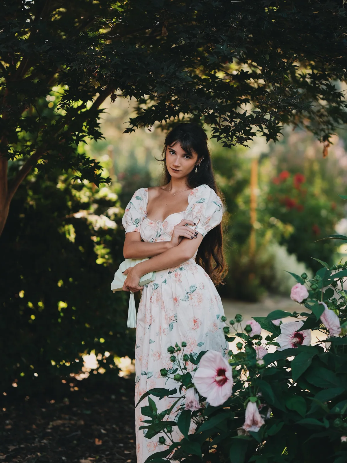
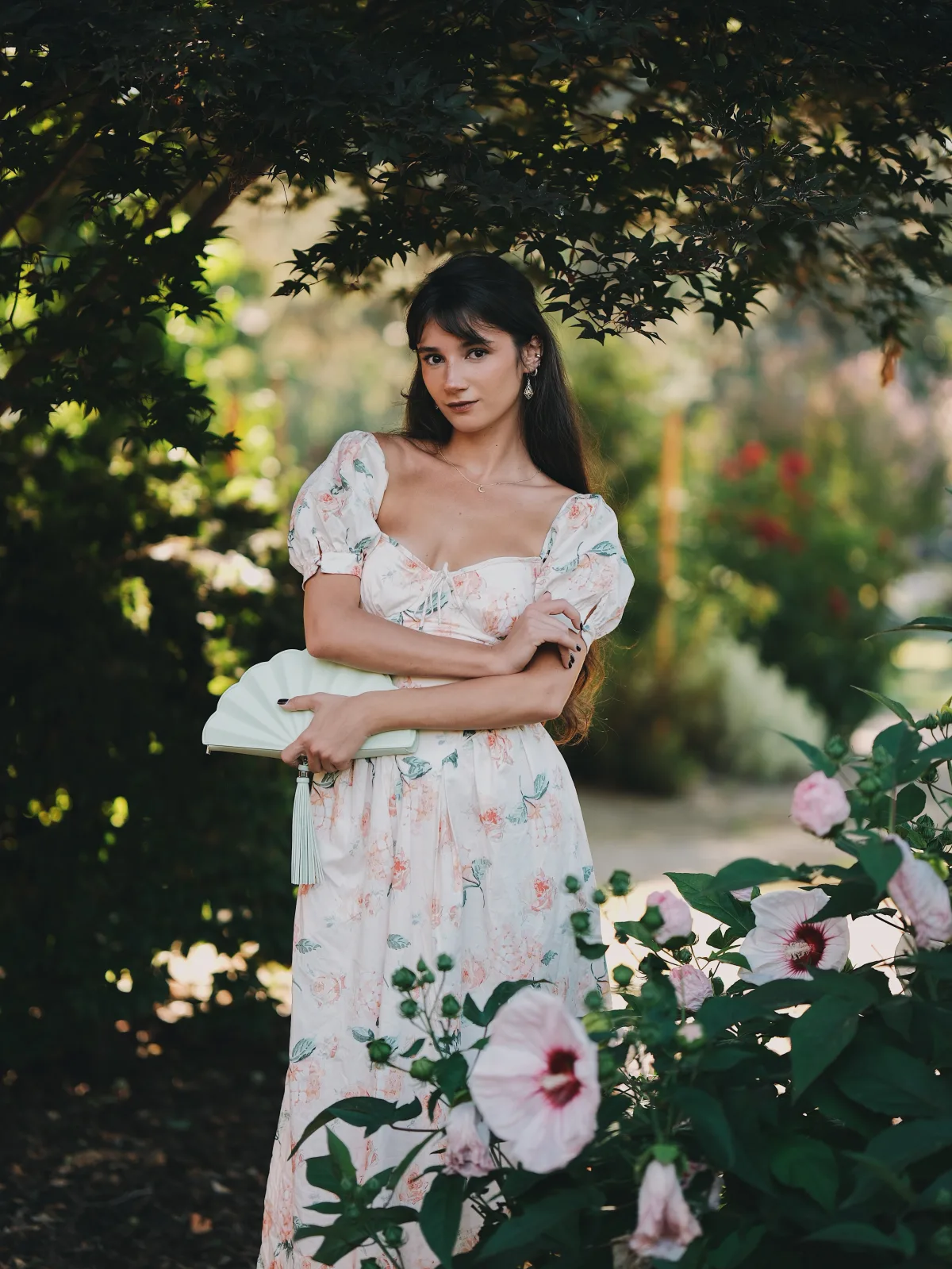
The last set, and the moodiest. Deep under a tree canopy with only filtered light reaching her, pale pink hibiscus in the foreground.
This is where f/1.2 stops being a look and starts being a functional necessity. Two stops down at f/2.8 this becomes an ISO 800–1600 shot; at f/1.2 I stayed at base ISO with a usable shutter speed. On a 40MP APS-C sensor that matters — you want to stay at ISO 125 to get everything the sensor can give you.
The dark, low-contrast light also flatters Classic Chrome. With no bright highlights to manage, the simulation's muted palette and lifted shadow response give the frames a quiet, filmic quality that's completely different in mood from the golden hour set that opened the day.
Verdict — Why the 56mm f/1.2 Still Stands Out
There are cheaper 56mm options on X-mount now, and several of them are genuinely sharp. Sharpness isn't the differentiator anymore. What this lens gives you that the alternatives mostly don't:
Micro contrast. The fine tonal separation that makes skin look dimensional and keeps similar adjacent colors distinct. This is the single biggest reason images from this lens look different, and it's the hardest spec to find on a chart.
Flare discipline. Shooting directly into low sun at f/1.2 without losing midtone contrast or catching colored artifacts. The lawn set at the top of this post would be much harder work on most alternatives.
Bokeh that stays calm. Small specular highlights — agapanthus florets, light through leaves — render as smooth discs rather than busy outlined rings. Backgrounds support the subject instead of competing.
Weather resistance. The R WR designation isn't marketing. Summer garden sessions mean sprinklers, dust, and humidity, and I don't think about any of it.
Paired with the X-H2's 40MP sensor and a Classic Chrome recipe dialed in properly, this combination produces JPEGs I'm posting essentially straight out of camera. That's the whole point for me — more time shooting, less time at a desk.
Full settings breakdown, including the Provia alternative and my complete autofocus configuration, is in the Fujifilm X-H2 camera settings guide.
Thanks to @rosinashakirova for a great summer session. Follow along on Instagram and YouTube for more.
Shop the Gear
Amazon:
B&H Photo:
Support
Enjoyed this post?
Every review means renting or buying gear, booking models, and scouting locations. If this helped you make a gear decision, a coffee goes straight toward the next one.
Related Posts
Fujifilm
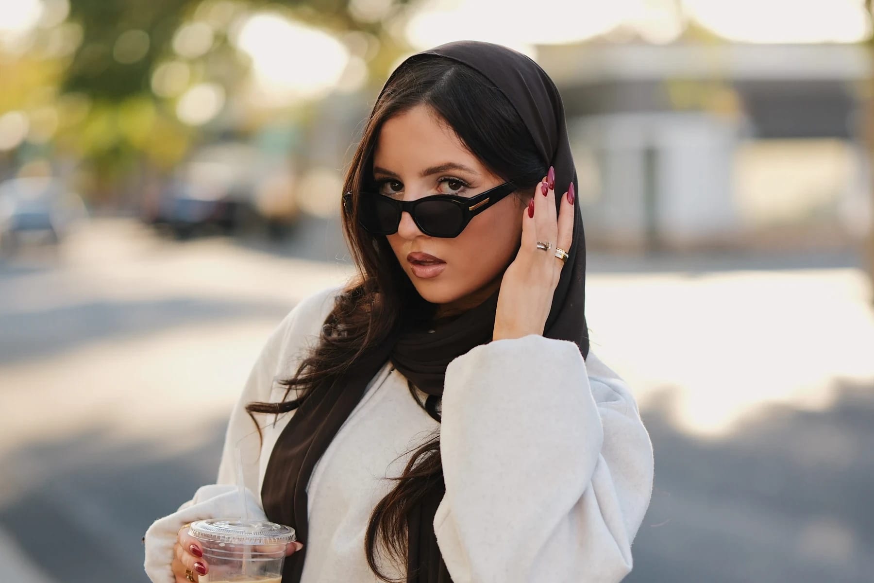
Fujifilm X-H2 + XF 56mm f/1.2 R WR: Golden Hour Street Portraits with Yasmina in Downtown Roseville
Fujifilm X-H2 and XF 56mm f/1.2 R WR wide open at f/1.2: golden hour backlit street portraits with Yasmina in downtown Roseville, full body and half body.
Fujifilm
Capturing Spring Style: XF90mm F2 WR Fujifilm X-H2 Portraits - A Photoshoot Walkthrough
Before diving into the photoshoot itself, let's take a peek at the planning process. The choice of the XF90mm F2 lens for this shoot was intentional.
Fujifilm
Fujifilm Lenses for Portraits: XF33mm F1.4 WR vs XF35mm F1.4 vs Viltrox 33mm F1.4
Today I am going to talk about the three X-mount lenses for portraits at the Fujifilm focal length of 33mm and 35mm, which are about 50mm full frame equivalent. These lenses are all new XF33mm F1.
Newsletter
Stay in the loop
Explore
From the Gallery